Friday, 30 September 2016

Magazine Case Studies - Practice (notes)

Today in lesson, we were practicing analysing some front covers of magazines. We did one with the class but we had to do one in a pair. However, these are just notes, therefore it means I might not have analysed the elements of the magazines thoroughly or haven't included things. These are just the notes I took during lesson.

VIBe Magazine
Front Cover
Image

  • 3 colour scheme: black, blue, yellow
  • low angle shot: connotes dominance
  • medium long shot: mise-en-scene - styled as a pilot
  • aeroplane in the backround; pilot costume; aviator shades - link to pilot, also star status. White t-shirt reinforces this. 
  • high-key lighting connotes star quality; iconic US star
Page Layout
  • masthead behind cover star
  • anchorage - star cover line & cover star; reflects image; big
  • skyline: other stars, key selling point
  • QR code & barcode & website link
  • star cover line & cover lines: aligned left; colour scheme; clean, simple fonts; sans-serif fonts
  • circle / plus sign / other symbols = puffs
  • serif fonts = more traditional
  • sans-serif fonts = more modern looking
Language
  • fairly informal - "young and reckless"
Genre
  • cover star
  • skyline
  • mise-en-scene: designer shades, watch...
  • simple, sans-serif: reflects genre
Contents page
Image
  • Medium long shot (MLS)
  • Body language
  • Mise-en-scene: clothing
Page Layout
  • One column; unusual
  • "features" - sub-heading
  • Features are more in-depth, longer articles
  • Page numbering chronological order - easier for audience to find the pages
Double Page Spread
Image
  • Mid shot (MS)
  • cigar: old-school, glamour, expensive
  • Pull quote
  • Q&A structure - bold for Q
  • 3 columns
  • Vibe logo


Q Magazine
Front cover

Image
There is a clear 3 colour colour scheme on the front cover. These 3 colours are red, white and black. It makes the magazine seem like it's an old issue of the magazine, which can be because the photo of the cover star seems quite old too. The photo of the cover star is a mid shot, which shows him when he was young. The cover star is dressed up in old clothes.
Contents page
  • 2 pages used for the contents
  • All editorial items are listed
  • 12 sections are in the contents page - all about artists; page numbers in chronological order; on one page, there are two columns, aligned both left and right; the only textbox is aligned left
  • Images of artists in articles used; shot types are mostly mid shots and long shots, have high key lighting, most of them were not taken in a studio; the pictures connote that the artists are well-known; the images link to the listings in the contents page as they are of the artists that the articles are about
  • The cover star is on the contents page with the cover story which reflects the cover. 
Double Page Spread
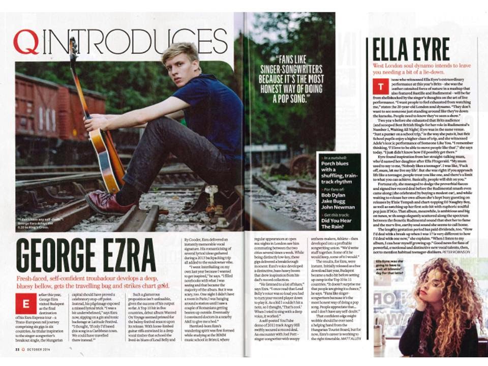
  • The double page spread is about George Ezra, a singer-songwriter and his trip in Hungary's capital, Budapest; the article has a beginning (introduction), middle (telling the reader about how he writes music and where he's been to get inspired) and an end (telling the reader that his career is getting better and that he is a very busy artist). 


Friday, 23 September 2016

2 Chosen Magazines For Analysis

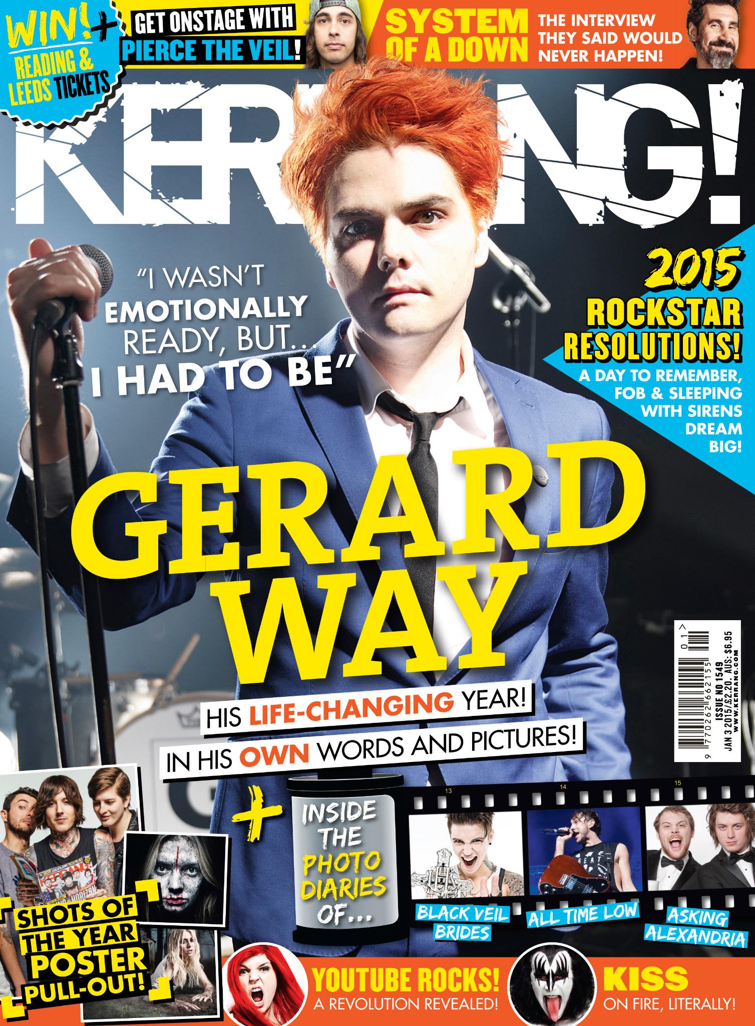
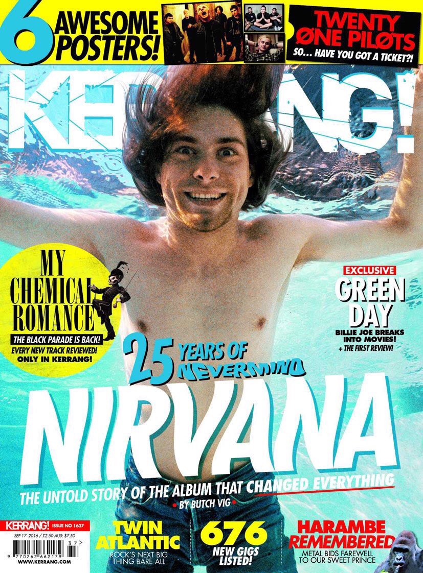
I found 2 really good examples of rock magazines which are Kerrang! and Rock Sound. Both magazines had to be accessible for me so I can buy them, which meant they had to be sold in England. Kerrang! was a more obvious one, however I had to do a bit more research to find out about Rock Sound.

I put several front covers of different issues of both magazines.


Choosing the Genre of My Magazine

Today, I had to choose the genre of the magazine I will be producing. For this, I had to do some research on types of music magazines. I had found several examples of different genres. The genres I could be writing about are RnB, pop, rock, electronic & dance and classical music. I wasn't sure whether I was going to make a pop or a rock music magazine, but I decided it will be a rock and electroic music magazine as these genres don't have a magazine together, only separately. Also, they seem interesting and I feel like I know and like more artists from these genres than any other genres. However, my magazine will include every kind of rock and electronic artists whether that's heavy metal, alternative rock, punk rock, synthpop, house, electropop or any other subgenre of EDM or rock music. I will now have to choose two magazines of these genres which I will write about in my next post.


Thursday, 22 September 2016

Finished Induction Article

This is my final product for the Induction task. Now I am going to evaluate this Double Page Spread.


Firstly, I had to think of what to write about in this article and what magazine to write it for. I could have written 5 facts about an artist or other 5 features of an artist, or songs of a genre. I chose to write about 5 electropop songs that I think are the best in this genre. I had to consider the success of these songs and their genre to make sure it was really electropop (as it can be confusing whether a song is electropop or is from another sub-genre of electronic music). So because of this, I had to do research about popular electropop artists. During my research, I learnt several things. I have found out about Mixmag which is a popular dance music magazine, so I decided that I will be writing this article for their "next" issue. I also found 5 popular songs/artists from this genre.  So after my thorough research, I had to draft the article. I decided on the order of the songs and write things about the article in the style of Mixmag (which I also had to research about). I wrote about 50-100 words for each, putting the most important information about the song and the artist, how the songs can make people feel and their success. I also wanted to put pictures on the pages, so I had to write descriptions for those as well. I had to decide what pictures to put on the Double Page Spread too.

As the best software for creating this article was Adobe InDesign, I had to learn how to use it. During the creation process, I gained different skills. I have learnt how to create an A3 sized DPS; make a textbox which was using the ‘Text’ tool; to make a box for photos using the ‘Rectangle Box’ tool; and to put photos on the page. I did the last one by going on ‘File’ in the upper left corner, then I went to ‘Place…’ and then I clicked on the box I created for the image. For this, I first had to search for high resolution photos and save them onto my computer, then place it onto the Double Page Spread. I have also learnt to make a drop cap (used at the start of each box; a letter/number that is bigger than the normal font size). In conclusion, I have learnt how to use the most basic things in InDesign.

However, I have things that I could improve on. My targets for improvement would be:
  • At the top of each box, the name of the songs touch the line framing the box, which I could put further up away from the text so it looks more attractive and neat to the eye.
  • I should not frame the title of the article as it might look more aesthetically pleasing.
  • I could also improve the article’s background because as we can see, it’s just plain white.
  • Also, next time I will not use pictures I got from the internet; I should take my own ones.
  • So this is my Induction Article and its evaluation finished. It has been a good experience to make this as it has improved my skills in research and writing an article which I will have to do later on in my research.


Production Schedule


This is my Production Schedule for the magazine I will be creating. These are the deadlines for the production which will guide me through the making of the magazine.

Tuesday, 20 September 2016

Introduction

Welcome to my AS Media Blog!

My name is Karolina, I go to Leyton Sixth Form College and I study Media as one of my A-level subjects. On this blog, I will be posting about my progress in my Media coursework which is creating a magazine. As another of my chosen subjects is Photography, I am looking forward to when I will have to take photos for the magazine and also, to learn how to use Photoshop and other editing software(s) throughout creating my magazine. I am excited about creating the music magazine as I've studied Media before, I had to do something similar and I liked doing it. 

Thank you if you take the time to read my blog, I hope you enjoy the content and find my progress and the subject interesting. 

Bye :)