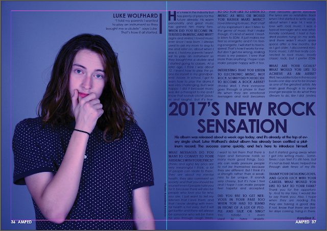
In today's lesson, I have continued making the contents page and this is how it looks at the moment.
I have looked at Kerrang! contents pages to help me with putting it together.
Tuesday, 29 November 2016
Friday, 25 November 2016
First Draft of Front Cover & DPS & Contents page
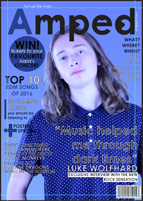
The front cover and double page spread is finished, however I still need to finish the contents page.
Front cover, Q&A, DPS - Work in progress
Today I have done many things. I have finished writing the interview with the cover star for the Double Page Spread.
Then I went back onto my front cover because I forgot to put in gutters on it. I will have to move everything inside those lines. I already started doing that though.
I have also started the Double Page Spread but I left it until I have done the font cover properly.
Friday, 18 November 2016
Front Cover - progress
As yesterday I have done the photography for my magazine, today I put the image on the front cover, but it didn't go with the red of the 3 colour colour scheme, so I had to change it to dark blue. However, I like this colour more and I like how it came out. I have added everything that was missing and this is the done front cover at this minute, but I am most likely to still change things on it.
Thursday, 17 November 2016
Magazine Photo Shoot
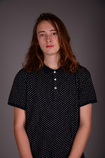
I was in the studio today and as I downloaded my photos off the camera.This is how my photos look.
Here is a contact sheet of the best photos taken.
Here is a contact sheet of the best photos taken.
Creating the Magazine - Work In Progress
In today's lesson, I started making the front cover, but I haven't taken the pictures yet for my magazine because I am doing it today. I am still going to add more cover lines but this is what I could do in lesson. It took me a very long time as every line of text was a different layer and when I had to move it around, it took a long time. The colour scheme might change, I am thinking of doing dark blue instead of red. However, this is what I've done in today's lesson and I have my photo shoot later on today.
Wednesday, 16 November 2016
Camera Induction notes
How to use the studio & camera
- 3 point lighting - for high key lighting photos
- JPEG / RAW file - jpeg takes less space but raw can be edited in more detail
- Nikon D7100 - camera I am going to use
- black & white = monochrome on camera
- transmitter - controls when lights flash through signals
- softbox - boxes to soften/diffuse lights coming from the actual light
- dial on left hand side - power of light
- set lights on 3 so they are not too bright or dark
- when done press green light to release charge built up in light, then immediately switch off in plug
- the model should be at least 5 foot away from backdrop
- lights: -hairline light=behind the model on the left/right, create separation to hit back of head, separates subject from backdrop; -key light=on the left front of model, most important light; -fill light=on the right front of the model, knock the other light's shadow out
- colour = standard/vivid on camera
Tuesday, 15 November 2016
Double Page Spread Article Draft - Work In Progress
In today's lesson, I started drafting the article for the Double Page Spread I am going to make. It is going to be an interview but it started out as a Question and Answer feature. I need to change some things on it and I also have to finish it, but I am writing this post to show my progress in today's lesson.
Monday, 14 November 2016
Plans for My Magazine - work in progress
These are my mock-ups of the front cover, contents page and double page spread of my magazine. This is roughly how I want them to look like. For the contents page, with the two boxes, I wanted to indicate that the contents and page numbers are going to be where the two boxes are on the page. For my front cover, I also want more cover lines but I didn't want to spend too much time on it. For the double page spread, the page is going to look like this but obviously with different text.
Front Cover
Double Page Spread
Front Cover
Contents page
Double Page Spread
Sunday, 13 November 2016
Flat Plan of My Magazine
In today's lesson, I have made a flat plan for my magazine which helped me plan where the cover story article is going to be and it gives me an overall picture of what my magazine's contents would be.
Saturday, 12 November 2016
Location Recces
As this weekend I have to do a photoshoot at an outside location, firstly I had to see what places were the best for my photos to be taken. Firstly, I looked on the internet find a place where I could take my photos. I looked on shotspot.com for a place in Shoreditch, but as I realised it was too far away from me, I looked up around where I live and didn't find many places so I decided to take a walk and I thought the park near my house was good for this photoshoot. This is where I am going to go to take photos.
Thursday, 10 November 2016
Evaluation of Feedback
I have found out many things during the feedback focus group.
This is what I have concluded from what people told me was good and what I still should improve on.
This is what I have concluded from what people told me was good and what I still should improve on.
- I have made the primary target audience 16-25 year olds and the secondary target audience 25-28 year olds, so overall my target audiences are 18-28 year olds.
- I am going to keep the font a sans-serif (Century Gothic in particular)
- I will think about and look at the magazines that have inspired me and see how the front cover, double page spread and contents page are done and I am going to do similar things with my magazine features to make it look professional.
- I am going to keep the magazine's genre electronic & rock music and I am also going to include upcoming stars that I have thought and made up.
- I will think about different platforms and other ways of distributing my magazine but as it isn't part of the actual features (front cover, dps, contents page), I am not going to spend too much time on thinking about them.
- I decided that my magazine will be available worldwide, but mostly based in the UK, however I will include artists who are from outside of the UK, making my magazine have a nice variety of artists which makes my magazine enjoyable and appealing.
- I will use tigercolour.com and other websites to find the exact colours that I want to use for my magazine.
Feedback from focus group
Feedback that I have received:
- primary audience age should be higher as 14-18 year olds don't read (most of them)
- good choice of font - simple, sans-serifs
- think about magazines that inspired me more (Kerrang! Rocksound, Mixmag)
- good that genre is a mixture of electronic & rock music - makes it its unique selling point
- think about different platforms: print, electronic (downloadable), social media etc...
- is it only in the UK?
- use tigercolour.com to find colours I want to use for my colour scheme
My Pitch Presentation
Last week, I have done my pitch presentation to the class and here is the video of it.
Wednesday, 9 November 2016
Masthead & Front Cover plan - finished
Today, I have finished the front cover plan for my music magazine. Even though there are not a lot of cover lines on it, I still consider it finished as I didn't want to spend too much time on this plan. This is roughly how I want the front cover to look like, with one person on it, perhaps wearing some kind of props and posing in a way that catches people's attention. For the plan, I used a photo I found on Google of Zedd (well-known electronica artist). I have put the star cover line and 2 other cover lines on the cover, as well as a puff about a competition where the readers could win concert tickets to their favourite rock artist's concert. I have also put on the website URL and the slogan of the magazine around the masthead. I think the plan turned out really good as I decided what I want the masthead to look like and also the layout and colours of the front cover I want to use. However, the star cover line is now skewed towards the right side of the page as I also moved the cover star's image to that direction because I think it looks better that way.
Tuesday, 8 November 2016
Masthead & Front Cover plan - work in progress
In today's lesson, I have been experimenting with the style of the masthead and I also tried making a plan of the front cover for my magazine. From the mastheads, I chose the bottom one as I really liked how it looked and I have asked a few other people about their opinions and most said they liked the bottom one the best. I have started making the front cover plan which is just a rough mock-up of what I want my front cover to look like when I take the photos and put the front cover together. I experimented with the kind of colours I wanted to put on the front cover as I wanted them to go with the cover photo. In conclusion, I think I have made good progress and I like how my front cover mock-up looks so far. However, I still need to finish planning.
Subscribe to:
Comments (Atom)


